Documentation
Documentation
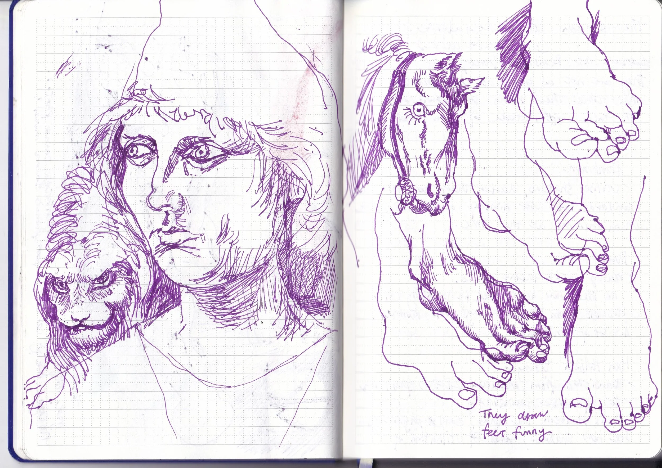
My favorite part!
Death Worm
Big Ground
This pink stuff is called BIG Ground. An Eco-friendly resist that can work as both Hard ground and Soft Ground. First, you desensitize the plate and workspace to avoid oily contamination, then you roll it on 3-4 times. It acts as soft ground until you heat it on a hot plate, then it turns to hard ground. These pushes for sustainability in printmaking are becoming more popular than ever. I love it
The only concern I had was how it would feel to draw on and how the result would differ from traditional grounds. The idea of doing both soft and hard ground in one pass of acid excites me. I have also seen people use Big Ground for photo etching( Gelli plate style). Maybe something to work on in the future.
Monoprinting
This is the first proof of this drawing. As this is just an induction, I just used one of my drawings as a guide to make something. Both the soft and hard Big Ground feel more plasticky than traditional grounds. You need to press harder and it is stiffer. Not a sensation I enjoy. There are also Big ground pieces flaking off as it was in the acid. (oil residue?)
I wasn’t happy with the result of the Big Ground. To try to salvage the plate, and also meditate on my next step, I started doing monoprints on the plate. They turn out much better than the original. I especially love the colored one. The brush stroke textures and the ambiguity of the face lead me into the picture. The black and white monoprint is a little bit too refined, especially the nose area. As someone who loves old master’s oils and prints, it feels weird for me to lean on the more abstract, liminal version of the print I created. On the other hand, abstract might be the only way to talk about concepts like fear and death.
SOAP GROUND! I LOVE SOAP GROUND! (sometimes)
It and soft ground are what I fear the most in etching. So unpredictable, with no indications of whether it is done or not. Thank god it worked on this plate. I threw white ground in as a sort of hail Mary, and I actually left it in longer than I anticipated. I love the texture it gave to both the dark and light areas, especially around the eye and cheek.
The draft this originated from is inspired by how Francis Bacon drew his portraits—with photo references and simplifying the face just enough that you can barely recognize it. He also allowed his subconscious to take over to create his ‘realism’. I tried to do just that when drawing from photography; the darkening of the cheeks and eyes came naturally, turning the subject into a head and skull hybrid.
This approach mirrors something Bacon often did, working from x-ray imagery in his art. Perhaps I could explore that concept as an exercise as well.
Sugarlift
The next day, we are doing a sugar-lift induction. Wanting to darken my image in certain areas, I did the sugar lift. The liquid ground got lifted off a bit in the acid before I was done etching the aquatint. Resulted in a half-botched grey tone. Hated it. On the bright side, I did some spit-biting on the hair part, inspired by the Norman Ackryod show. The unpredictable layering of textures from the soft ground and the spit bite in the controlled area of the sugar lift. One disadvantage of sugar lifting is how black and white it is. In hindsight, I shouldn’t have used this method as I was trying to walk the line between the abstract and the recognizable. A harsh area of tone is tipping my balance even if the aquatint worked as intended.
Plaster Experiments
I have always had the idea to create 3D plaster sculptures using etching plates as molds. However, I am unsure how to approach this, and to be honest, it feels quite daunting. I know I need to start small, or I will never begin at all. This is exactly what this is: my first step toward something significant.
I have performed plaster castings thousands of times, just not with an etching plate. The process worked remarkably well; the plaster captured all the nooks and crannies of the inked etching plate. The black is not as dramatic as it appears on paper, but without a direct comparison, the plaster version seems fine on its own.
The sunlight shining on the plaster makes the ink shimmer, enhancing all the embossed details. This effect could be worth considering when displaying plaster etchings in future exhibitions.
Pull

Small experiment
I have always incorporated drawing from the unconscious into my work in small ways. After reading Francis Bacon’s work and interviews, I want to loosen up and express my feelings instead of just using pretty pictures and metaphors.
As making an etching takes forever, I needed something quick to test out ideas. That is where my quick, inexpensive drawing paper comes in. I used the cheapest ink and paper I could find, although there are a lot of drawings I don’t like. I am able to create a few compositions or ideas that spoke to me like nothing before.
This etching is made alongside the Death Worm from above as a little test. I have been drawing with lines since I could hold a pen. I am passionate about it, but it does get old. I try to get some variations in by deeply biting the hard ground lines.
I left it in the acid and I forgot about it, it was in the acid for 4-5 hours? The main thing I love about this is how sculptural the edges are. It feels like the paper has a nasty scar, and we as the viewers are glimpsing into it, figuring out what has happened. I have done bitten edges before, but never took it this far, I wonder if I can use this as a way to illustrate the unconscious not as a window, but as an accidental portal our minds open when repression fails.
Pull 2
The starting point for this came from the last etching. The last one was quite small, and I have plans to develop the image further. I was also talking with Brian about burnishing with steel plates, and the pearly whites it can create. So I took one of those used plates near the guillotine and started sanding out the old image.
I then did a simple hard ground for mapping out where everything is roughly situated. I also found out you don’t need an aquatint for steel to go fully black, and unlike the other metal, it will stay dark however long you etch it. So I just went ham with a litho crayon to create highlights, then dropped it in acid for an hour. As a result, it was too much for the crayons and I think some of them got etched away in the process. It was extremely dark. I was prepared, to burnish it, until I was satisfied.
During the hardground process, the hands in the drawing took center stage. Everything becomes secondary after the hand is drawn. The harsh grip and the twisted fingers grabbed my interest. My drawing originated from my fear, and the feeling manifested from fear. This drawing is about maintaining relationships, in particular, being in a relationship feels like stepping on groundless ground, the more you love, the more vulnerable you are, and it sometimes scares me. This kind of fear feels like being hung or hanging, exposing yourself to the other one. The being hung part was originally the main focus, but this image shifted it from the hanging to the hands. A desperate grasp that depends on both people, hoping that they can lift each other off from fear, and everyday life.
For the next two weeks, I burnished and burnished, it was never-ending. Steel is much harder than zinc and copper, so burnish it was not easy. The result is much rougher than what I was hoping for. Without the safety net of openbiting it back to a grey, it all depends on the meticulous ways of burnishing.
As this plate was quite big and it was the start of the school year, I felt like I was biting off more than I could chew. Although the final result is not what I envisioned, I had to let it go for now. I always get so excited when discovering new things that I get blindsided into doing something huge. Losing precious time that could be spent on learning new things. Whenever I get the chance to do something big, I need to remind myself of the bigger picture and think about what final destination I want to arrive at this year, instead of jumping into every opportunity I can get.
Big Drawing
Going Big
After the discovery of hands in my last etching. I started experimenting with scale. Something my tutor Jo said to me got stuck, the ickiness of my previous image showed only some but not the whole body, especially the foot. I have been drawing these out-of-frame figures for so long that I don’t have those feelings anymore.
I remember I was in a live drawing class a few years back. The tutor explained that she too struggles with drawing people out of the frame. Later she just went with it. It was very inspiring for the younger me, and open my eyes that finished art doesn’t need to be whole in any way. I still remember her weird ways of mapping a 3D map of the body with dots on paper before filling in the details of the life model.
The unsettling feeling that something is out of frame, leaves you to linger on the image, and try your hardest to figure out what is and will go on in the picture. Fear only happens because of the future unknown. I tried to include feet in this big drawing, but it felt too resolved in the end.
Notes after Jo’s Tutorial:
the bigger the paper is, the less control I have.
My subconscious takes over, for example, the hands are huge. It helps me move the image along, and mature it.
The footprints from stepping over the paper got me excited, Why?
It shows the process, of me creating and thinking.
Jo said the red makes it edgy, I just grabbed the first color I found for it. I never liked it when people say my stuff is edgy. Why?
I am trying to get away from that for a long time. It also seems immature, when there are already so much going on in the world. Why does that comment bug me so much? The word edgy sounds like what you would describe as a 10-year-old pretending to be old.
Need to figure out my way forward
Push

Draft
I grew tired of making the pull image, and there was a lot of refocusing that took place in that image. I started with a blank slate. After meditating on paper, this image emerged from my unconscious. It is partly inspired by my fear of the meaningless push of Sisyphus. I kept the exaggerated mingling of hands and the faceless protagonists.
Hardground and sugar-lift
I have been relying on the ground to make the draft on etching plates since the beginning of this school year.
Pros: easiest way to stay true to the image, I love the line quality it gives for the final results.
Cons: It limits the image, and doesn’t allow the randomness of acid to spread its wing. The result feels too safe in the end.
I love etching, but everything feels so safe. It might be because of me burning out on one technique, or my draft on paper feels more vicious and primal than the finished product. I might leave etching for a bit to try out different stuff like monoprints. I need something more is ‘louder’
Softground and white ground
These technical stuff are getting boring, I am boring myself talking about these. The part that I love is the open bite and aquatint of the background. That clear definition of the hill and the sky gives this muddled imagery an anchor point. It situates the image with the original theme of the uphill struggle of Sisyphus. My boulder is this damn etching.
Rolled on purple
After printing the final product, I feel like it is missing something. the two main humans are too prominent. To knock them to the background, I tried rolling this beautiful transparent royal purple(credit to Shiela for creating such a beautiful color) on top of the etching plate before printing. I still haven’t figured out which one I like more, I think it will need to marinate a little bit in my brain before I can give out a final verdict.
Monoprints
Trees have been a constant subject that I draw. To me, they represent innocence, much like the tree from the Garden of Eden. They are ever-growing; I might even say they are a representation of stoicism. While the figures in my work illustrate the emotional range of humans, the tree embodies the opposite.
A new start
Occasional workshop inductions and little experiments aside, I have little to no experience in monoprinting. It always feels very daunting, and the results are seldom successful. Fiona encouraged me to try mono-printing. This is the first piece I created: a three-layer monotype on wood. The image is inspired by a lenticular print of Jesus and Mary that I found on the street. I scanned it, allowing the two images to merge into one. I aimed to capture the moment where the two images intersect through this monotype.
There are two aspects of this image that I particularly appreciate. The first is the hands; they are vague, as I only drew them in silhouette. Amidst the surrounding details and noise, they stand out as the focal point due to their blindingly white appearance. The second element is the face. Jesus and Mary blend into one, and I am surprised by how much I can layer and overlap while still retaining their distinct features. This duality reminds me of the duck-rabbit illusion.
Monotype is fun, but I hated the grainy texture it inherently has. It is also really unpredictable because there are no accurate ways to register the image through different layers. It’s a lofi way to introduce the unpredictability and unique texture that printmaking could bring to the table. I will not do this for my work in the short term.
My first big monoprint

After the mono-printing experiments, I wanted to see if I could marry both drypoints and monoprints together. I first started with similar imagery that I had used before just to test things out. Drypointing on a thin aluminum plate is much harder than I remembered. I also heard from a classmate that aluminum is pretty toxic for human beings, so I started wearing masks and minimizing contact with the plate. These plates are free and great for experiments, but I would use a thicker plate next time. The thin plate wobbles around, and it is very easy to dent a corner or two. This is something I need to take into consideration when I am striving for perfection.

https://www.illusionsindex.org/i/duck-rabbit
An Evolution of Mary
After the first experiment with monotype, I soon moved on to mono-printing. There are two main ways to do it. The first is to draw with thinned-down paintings onto smooth surfaces, and print. This method shown on the left never worked as I wished it did. I think this method relies a lot on experience and feeling. The amount of oil or solvents it takes to thin the paint down to an optimal level when it is smooth enough to paint with a paintbrush but solid enough to be printed on paper. I haven’t found that balance yet, resulting in really streaky prints. The other thing is I haven’t figured out why I should do this kind of print, it is basically an oil painting that has been reversed. Something that I am glad I tried, but will not develop further in the near future.
The second method is to roll ink on a smooth surface, then use various equipment like cloth, brushes, and pointy points to wipe the ink away. I have always been interested in wood engraving, a process where I am carving light into darkness, this monoprint method is similar to that. This might be the reason I am very drawn to this method. The crispy white edges against the velvety black background never get old. I am still in an early development stage with this method, there are still a lot of improvements I could make. I screwed up on Mary’s face in my opinion. Using a cloth and a thick brush I was provided at that moment meant that I couldn’t get into the details. I wonder if I have more time to sculpt those faces and more patience to map out a complete image, what amazing artwork I can achieve. Every time I do mono-printing, my brain always pushes me to do it quickly. Maybe it is how mono-printing is perceived as the ‘faster’ type of printmaking, or maybe I watch one too many short videos on mono-printing. I need to finish them quickly, the result is often a hasty mess. This is a mentality that I need to change in order to produce higher-standard monoprints. I will look out for this sort of perception in the future.
A merge between drypoint and monoprint
This is the final monoprint I did and my favorite one so far. I tried to be looser with the drypoint process on the plate. Grabbing the drypoint needle like an ape, relying on my forearm to draw instead of my wrist. It resulted in deep scratches and uncontrollable strokes. After looking at those scratches, I had an idea to roll ink on top instead of inking it like an intaglio. Because of the raised burr lines from the scratches, the ink from the roller wasn’t able to touch the lines, it created a reversed intaglio. I then wiped the plate with a cloth to create light. Maybe the press pressure is wrong, or the paper is too wet, but the black parts are patchy instead of a beautiful black. The imagery is also very rough, the hands I have shown and kept in the previous images are gone. It is a fun experiment and I love how the unconscious drypoints I did are harsh, while the conscious wiping of the monoprints is soft. The textures of different techniques may be a good way to show the state of being I was in when creating artwork and converse with the audience when they are looking at the final work.
Screenprinting Induction
Screenprinting was fun to play around with, but it lacks the depth of other printmaking techniques. I played around with puff ink and printed it on a T-shirt. The puff binder works really well, when you heat it up with a heat gun, the puff ink grows like cancer. I have no idea what else I can use it for, so I will leave it for now.
I also did a print on this drawing I did on acetate. A lot of the details got lost during the screen-making process. I printed it on silk instead of canvas materials, hoping the finer textures of silk could yield a more detailed print. Unfortunately, the result is very disappointing.
Lithography
This was from the offset lithography induction. I didn’t finish the four layers; I just lost interest halfway. I feel like this process is much more suitable for graphic works with no washy details. It is very unpredictable, and when I printed the purple layer, I just felt so defeated that I stopped. It sounds horrible that I just gave up halfway, but I have experimented with this process before, and it feels exactly like the process I hated two years ago. I love trying new things, but redoing things that I dislike is just torture. This was the last induction we had; I was pretty bored by then, and I had a lot of personal projects I wanted to start.
These are all the lithographs I have done at the start of the term. I had no clear vision of what I wanted to create, so I drew inspiration from various sources. This included my experience learning to play a new instrument called the ocarina and some objects I sketched during a trip to the V&A. While I have done traditional lithography before, I still feel quite inexperienced with this technique. For me, it is the most challenging printmaking skill to master, yet the potential for creating stunning imagery is limitless. The biggest challenge I face with lithography is my patience; the image always looks good on the stone, but as soon as I start inking it, the imagery quickly becomes obscured. This often results in a blob of black on the paper. Stone lithography is an area where I wish to improve and experiment further, and Camberwell offers such an amazing studio for it.
Relief
Apparently this is very expensive wood that a technician grabbed for me in the relief induction. This made me so scared of this piece of wood that I never finished it. Even now, I am scared of this. This is a huge problem for me, I am sure everyone who makes art has it, staring down a blank paper, trembling upon the endless. It feels like stage fright, and the audience has thousands of thoughts and ideas. I jigsawed it and printed the first layer, but never got around to finishing it. Although it is a huge waste of material, I feel like my time is more important. I think being an artist, and knowing when to push through and when to fold is an important skill, and I am sure I will make tons of mistakes in the future. The only hope I have is to have more wins than losses.

In order to have finished work by the end of the induction, I just did a simple lino inspired by one of my drawings. After carving the wood, it feels much nicer to carve on lino. The question I have when carving lino is, why lino? It is such a product that carving into it feels very disconnected from nature. When carving into wood or etching into metal, you feel the sense that the acid and the wood have their own say on how the image is made. The feedback they have given me is paramount to how I create imagery. Lino feels dead, smooth, and non-talkative. The only advantage it has is the size, you could go huge without spending serious money. Something I have been itching to try is to carve a lino so big even a press can’t print it. I had seen some of Jake Garfield’s prints in Woolwich before, and the scale of these prints stopped me in my tracks. The only complaint I had is it is as flat as a screenprint. If I ever did something this size, I would load it up with ink, maybe do some gradient roll-up, and maybe some jigsaw as well, oh also, lino etching.
Next

For traditional 2D stuff, I want to work bigger, and freer than before. I think I will do more monoprints, etchings, drypoints, and carborundum, or a mix of all the stuff above. This is the one I am working on right now.


I also want to push the plaster experiments I have done further, I am researching abstract shapes and the feelings they provide. I made this mold out of thin aluminum sheets, and put carborundum in it, inked it with etching ink, then cast it with plaster.
It looks like one of those medieval weapons called a Morning Star. I wonder if I can add more materials to it, or any other ways to showcase these types of works.
Jake Garfield | The Royal Drawing School (2016) The Royal Drawing School. Available at: https://www.royaldrawingschool.org/artists/drawing-year-alumni/jake-garfield/ (Accessed: 21 January 2025).