Additional Research
Additional Research

Last but not least
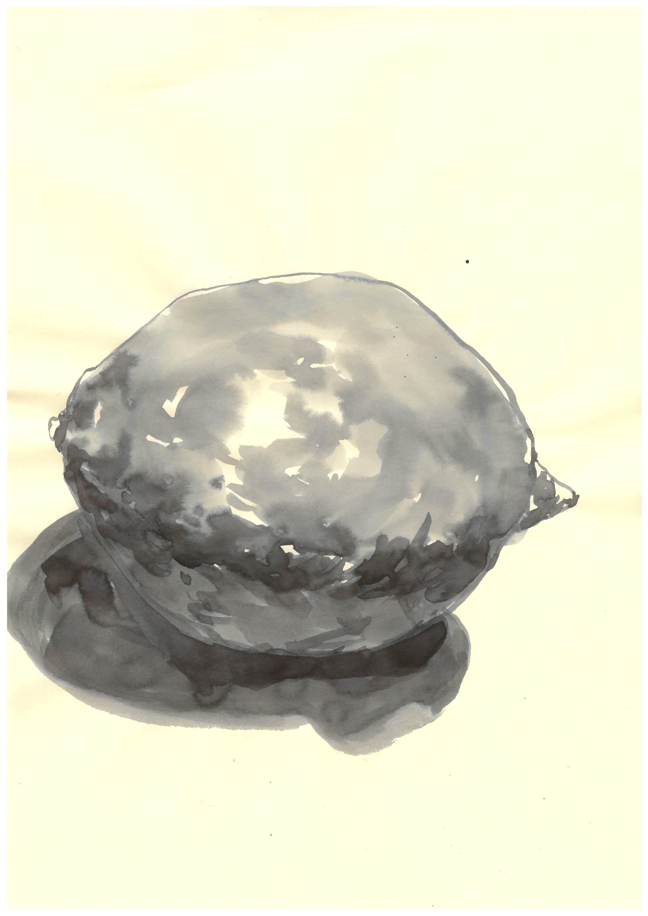
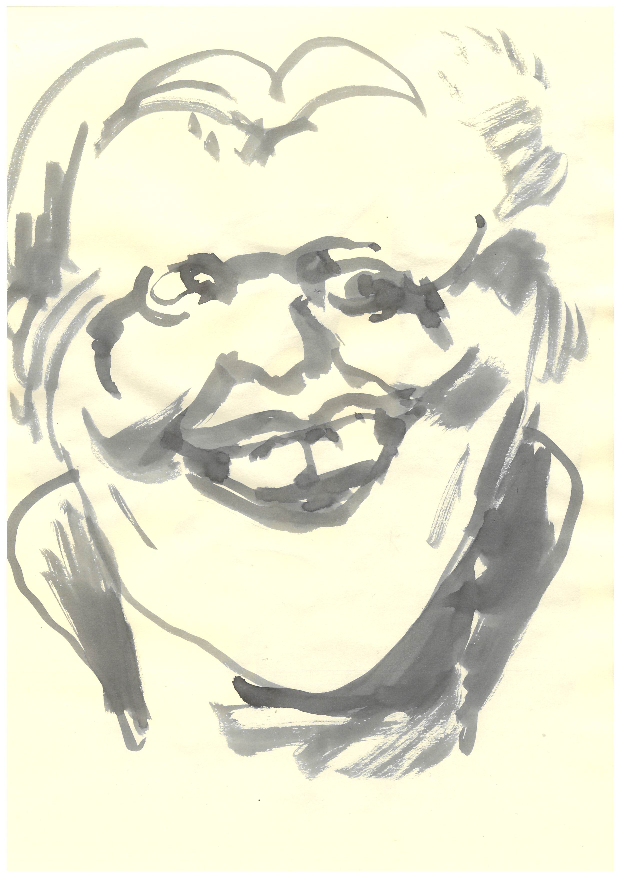
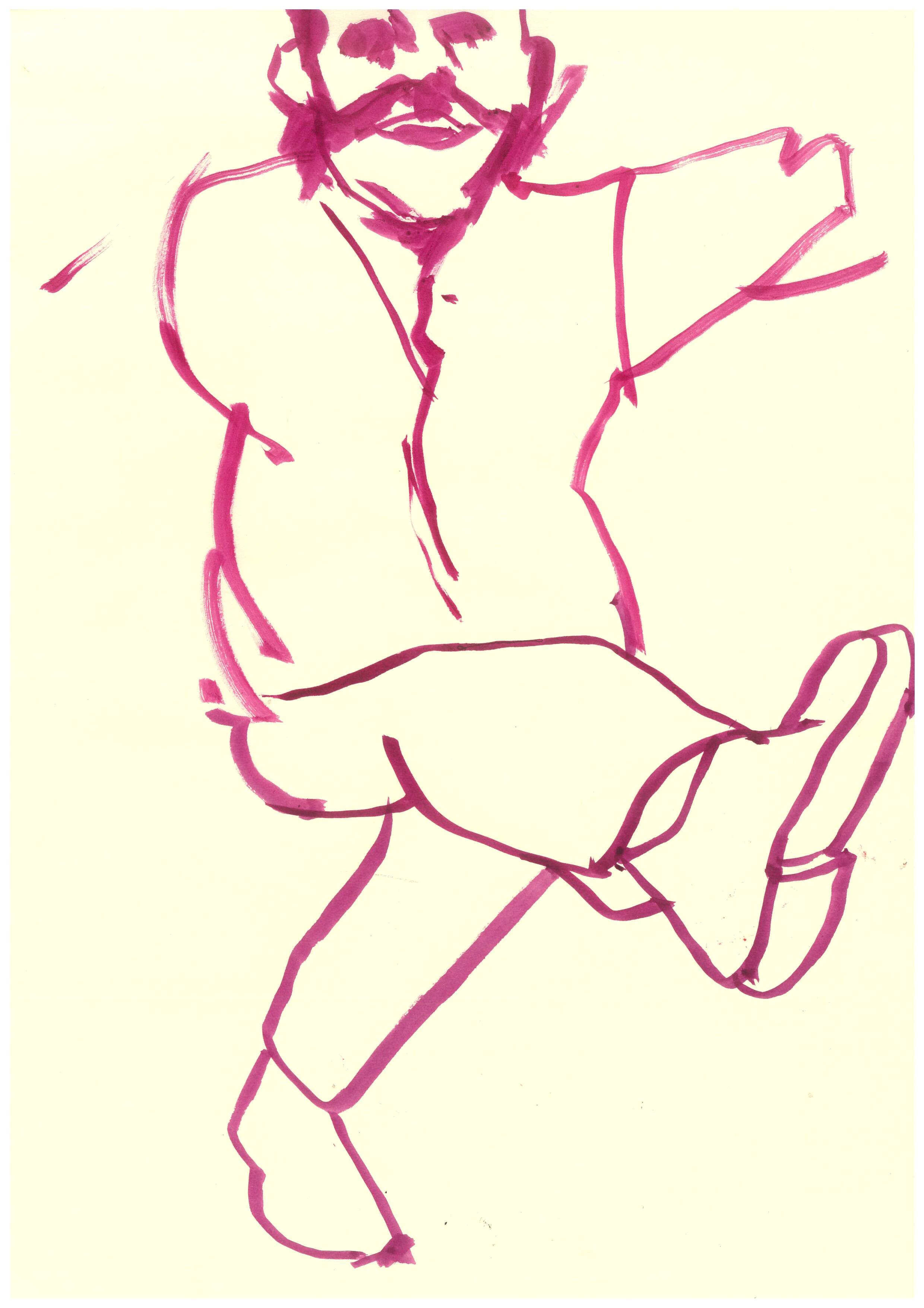
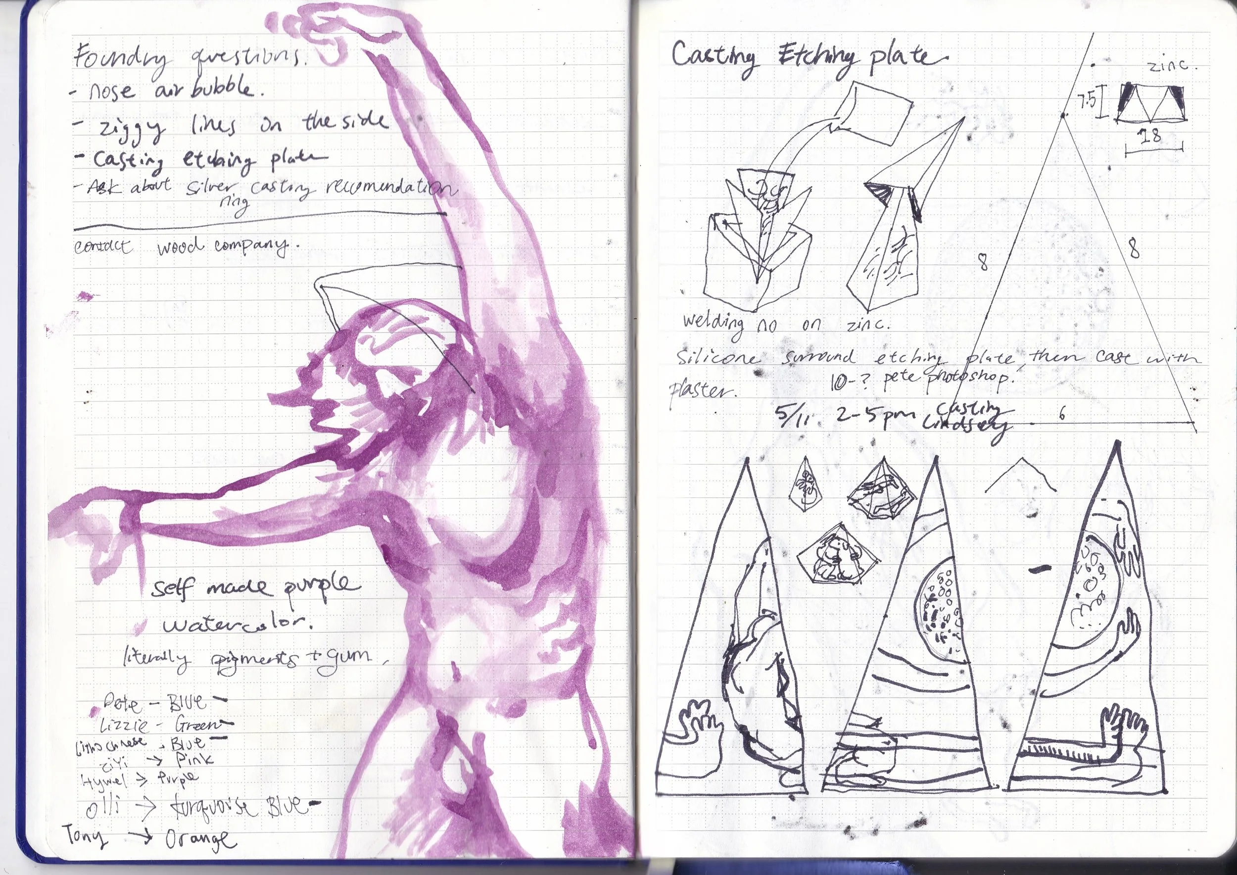
Notes and Sketches


Pigments Workshop by Craig
A really educational workshop on pigments and dyes. I got to make my own watercolor with gum Arabic and pigment! As simple as that. I always thought making these materials required a much more refined and complicated process. It’s not particularly useful for my current art practice, but it is something to keep in mind.
Fun fact: Mummy brown was made out of real mummies in the Victorian era.
Woodworking
I have always wanted to try out woodturning. Making a piece of functional art from a plank of wood almost feels like alchemy. This might also be the reason I love printmaking so much: to willfully alter the state of natural materials and bend them to my will. Laura, the technician, happily let me use a pine softwood as a practice run. The softer the wood, the easier it is to carve, but it is harder to add detail. It was fun, and the kickback of my tool hitting the wood felt like shooting a gun. I love the process, but I worry about how I will be able to merge this with my fine arts degree. I have a lot of other hobbies, like whittling and leathercrafting, but they all stopped once I began my master's degree. I want to get the most out of this program and improve my art practice in both my research and techniques. This year is passing so fast, and I still haven’t tried out ceramics!
Urn for my loved ones
This is an urn I made for my grandma. I sourced some purple heart wood. It is much harder than the pine, and it holds details and finishes like a champ/. It took me forever to just carve and polish it. This little urn burns me out of woodworking. I am glad I finished this and I will come back to this process when I have another idea.
3D experiments
Casting Experiments
I have always loved 3D printing, turning my goofy sculptures into reality. I tried to make them as big as the printer allowed. The first one didn’t come out well; the head failed to print. Under the suggestion of the technician, it was turned into a vase for my newly bought plant. The other one turned out amazing and cost £17 to print. I haven’t finished sanding and perfecting it, but all in due time.
I made some figurines back in the summer, and I molded all of them to cast more. It is as satisfying as pulling a great print out of the press. I used Jesmonite as it is water-based and easily dyed. I can use normal acrylic to achieve different colors.
It is quite different from what I paint and print, but creating these little figures brings me joy and keeps me sane. Jo says it would be a great idea to merge this with my prints, I agree that I split myself into a lot of directions. In this 15-month master, it might be a better idea to focus on something and really drill into it.
Bookbinding Workshop


The examples shown are phenomenal. I am surprised by how a simple accordion-folded book can have so many variations. The last image with the simple Japanese binding is a great idea if you have loose paper or a series of loose artworks. It essentially acts as a fancy and durable staple. The only issue is that the binding requires some area of the paper to be covered, which might not work with artworks that lack paper borders.
BRITISH MUSEUM PRINT COLLECTION
(Tampoco), plate 36 from "The Disasters of War" (Los Desastres de La Guerra)
Plate 71: Contra el bien general (Against the common good).
I went to the print collections in the British Museum and requested some Goya and Holbein prints.
Although Goya’s prints are not as well printed as I thought, the aquatint is very uneven and the amount of plate tone scattered through the plate is just plain unprofessional. The imagery brought me to my knees, the most successful ones are the static imagery shown in the Disasters of War series. They give you space and time to reflect on the consequences of war in front of you.
I didn’t see much of the Holbein stuff, the book is full of words. It feels special to read a 1500s book in hand, with my actual fingertips and not through a piece of glass.
Plate 77: Que se rompe la cuerda! (The rope is breaking).
Kip Gresham The Legacy of a Master Printmaker
Some of the images are amazing, the textures they achieve with purely screenprinting are jaw-dropping. I never liked screenprinting because of its lack of texture and process. They are exposed on the screen, and printed. The process is just too boring, with no variations.
The only redeeming factor is the transparency and quickness of it. I am inspired to do some quick, big tusche layered drawings then screen print them with different colors to see what can happen.
Emma McNally The Earth is Knot Flat
I love the flashlight part of this exhibition. Everyone has a flashlight and can shine it wherever you want. You feel like an investigator trying to figure out what is happening to this charcoal wasteland. Her drawings look like a mess, but a coordinated unconsciously drawn mess.
I also love the high ceiling of this gallery, the higher bits of the paper feel enormous, and it feels scary to walk around with a flashlight in hand, like an artificial tree. When I visit galleries, I often think about how would my artwork look on these walls. I was imagining what I would make specifically for this place, to suit the architecture and lighting. I was imagining a big human statue from floor to ceiling looking down at you.
Mike Kelley
Mike Kelley's works on pop culture are fascinating. Especially his low-budget films. I especially love this skull reflected on water video, the ever-changing face of the skull turns this easy-to-interpret object into a mystery.
I wonder if I can do the same with my drawings.
Norman Ackroyd
Calm landscapes and furious waves.
He mastered spit bites, really wish I could have seen him before the unfortunate event of his passing. Seems like a great man.
Micheal Craig -Martin
The colorful ones are like a visible headache. The bold outlines and sickly fluorescent colors are not fun to look at/ The only one I like is this Death one on the left. I was always taught to not use words when drawing, it defeats the whole purpose of illustrating. This artwork boldly uses words as a symbol, the greys and blacks of the word Death contrasting his usual lively drawn man-made objects inspires people to think about material possessions themselves.
Tracy Emins
Tracy Emin’s paintings are hauntingly beautiful. Especially the life-sized face paintings. They look like ominous gods looking down at us puny humans.
She always works on 20-odd paintings a the same time. Is that the secret to creating artwork like hers?
Yoshida: Three Generations of Japanese Printmaking
I love these two Egypt prints because of how simple one color can change for the print. By just changing the colors, two image tells two different story. One is about the first steps towards adventure, the other one is the defeated return of the group.
Michelangelo, Leonardo, Raphael RA
I love the atmosphere of this exhibition. Maybe because that period of art is inseparable from religion. The rooms are dark with few concentrated light sources on the exhibited items. I especially love this draft in the video that was shown in a dark room with just dim light shining on it. I think the purpose is to protect it as it is one of the biggest drawings Leonardo has done. The thing is, my vision blurs a little bit when the room darkens, and the drawing looks much more mysterious and visually interesting than the other brightly lit drawings in the other room. I might put lighting like this into consideration when I show my artwork.
Picasso: printmaker
Greasy sugar-lift looks fun
I love the emphasis on details in some parts and the lack of them in others. He is an expert at guiding peoples’ eyeballs through his drawings. I wonder if it is the simplification of subject matter in his drawings that makes it easy for the eye to understand the image. This image on top is rather messy because of multiple subjects fighting for attention, in my opinion, not a great image. The two on the right have at most 2 subject matters, using shadows and details, he told us which part to look at first. I think they are much more successful as images, they catch your eye even if it is across the room.
Francisco, G. (1810) (Tampoco), plate 36 from ‘The Disasters of War’ (Los Desastres de La Guerra) [Etching]. Available at: https://www.metmuseum.org/art/collection/search/334470 (Accessed: 13 December 2024).
Francisco, G. (1810)Plate 71: Contra el bien general (Against the common good).[Etching].
Francisco, G. (1810)Plate 77: Que se rompe la cuerda! (The rope is breaking). [Etching].
Mike Kelley Ghost and Spirit (2024). [Exhibition]. Tate Modern, London. 3 October 2024 – 9 March 2025
Norman Ackroyd | Notes on Water (2024). [Exhibition]. Eames Fine Art, London. 12 September - 6 October 2024
Picasso printmaker (2024). [Exhibition]. The British Museum, London. 7 November 2024 – 30 March 2025
Michelangelo, Leonardo, Raphael Florence, c. 1504 (2024). [Exhibition]. Royal Academy of Arts, London. 9 November 2024 - 16 February 2025
Yoshida: Three Generations of Japanese Printmaking(2024). [Exhibition]. Dulwich Picture Gallery, London. 19 June–3 November 2024
Michael Craig-Martin (2024). [Exhibition]. Royal Academy of Arts, London. 21 September - 10 December 2024
Emma McNally: The Earth is Knot Flat (2024). [Exhibition]. Drawing room, London. 2 October 2024 – 15 December 2024
Kip Gresham | The Legacy of a Master Printmaker (2024). [Exhibition]. Eames Fine Art, London. 3 December 2024 - 12 January 2025